Home > News > Blog > Why is the scale hard to read on some insulin syringes?
share
Why is the scale hard to read on some insulin syringes?
Oct 14Source:Intelligent Browse: 2
The scale on an insulin syringe is hard to read for three clear reasons: the barrel is very narrow, the graduation lines are tiny and close together, and the contrast between the ink and the clear plastic is poor. This design trade-off is common, so you are not doing anything wrong, and your eyesight is not failing. When markings are hard to read, giving the correct dose becomes riskier, and a small error matters with insulin. Understanding why these marks are hard to see helps you handle the syringe safely. Manufacturing choices, not your vision, cause most of the challenge. You can work around it by using good lighting and reading at eye level.
Key Takeaways
Insulin syringe scales are hard to read because of how they are designed, not because of your eyesight.
Smaller barrels put unit marks closer together, so they are harder to see.
Always use the syringe scale that matches your insulin strength to prevent mistakes with your dose.
Half-unit marks help you measure small doses more exactly.
Use bright light and hold the syringe at eye level to make fewer mistakes.
How Barrel Size Affects The Insulin Syringe Scale
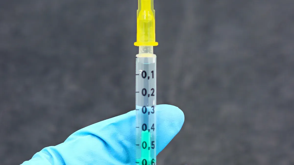
The physical size of the barrel directly changes how easy or hard the scale is to read. A 0.3 mL, 0.5 mL, or 1.0 mL barrel all use the same unit scale for U-100 insulin, yet the markings sit at different distances from each other. This difference matters when you draw up your dose.
Smaller Barrels, Smaller Markings
A smaller barrel holds less liquid, so the maker must fit the same number of unit marks into a shorter space. On a 0.3 mL insulin syringe, you see numbered lines at every 1-unit interval. The same holds for a 0.5 mL syringe. A 1.0 mL syringe, by contrast, often numbers its markings at 2-unit intervals. That wider interval creates more space between each numbered line, which can make the scale on the barrel look less crowded.
The trade-off is clear. A 0.3 mL barrel gives you finer markings for small doses, but those markings sit very close together. Your eye must work harder to separate one line from the next. A 1.0 mL barrel spreads the lines apart, yet you lose the fine detail needed for doses between the numbered marks. The table below summarizes this relationship.
Barrel Volume (U-100)
Unit Marking Increment
Effect on Readability
0.3 mL (30 units)
1-unit markings (some with half-unit)
Finer markings make small doses easier to measure
0.5 mL (50 units)
1-unit markings
Finer markings for small-to-moderate doses
1 mL (100 units)
2-unit markings
Wider spacing between numbered lines; doses between lines are harder to measure accurately
A 0.3 mL insulin syringe is a good example of a small-barrel design. Its compact scale packs 30 units into a short barrel, so every line sits close to its neighbor. You get precision for small doses, but the tight spacing demands careful reading.
Matching The Syringe Scale To Insulin Concentration
The scale on the barrel is marked with calibrations for a specific insulin concentration. A U-40 syringe matches insulin that contains 40 units per mL. A U-100 syringe matches insulin that contains 100 units per mL. The same numbered mark therefore represents a different liquid volume on each scale. At 0.5 mL capacity, a U-40 scale shows a maximum of 20 units, while a U-100 scale shows 50 units. At 1 mL capacity, the maxima are 40 units versus 100 units.
This difference creates a serious risk when the syringe matches the insulin incorrectly. The concentration ratio between U-100 and U-40 is 2.5. If you draw U-40 insulin into a U-100 syringe and read the same number, you deliver only 40% of the intended units. If you draw U-100 insulin into a U-40 syringe, you deliver 2.5 times the intended units. Both directions of concentration mismatch can harm you.
Always match the syringe scale to the insulin concentration printed on the medication label. Vetsulin and ProZinc vial labels specify U-40 syringes, while HUMALOG U-100 vial instructions specify a U-100 syringe. For U-500 insulin, you need a dedicated U-500 syringe. Using a U-100 syringe for U-500 can cause a 5-fold overdose if you misunderstand the syringe units. The relationship between insulin concentration and syringe scale is not optional. It is a safety requirement for every correct dose of insulin you draw.
Graduation Spacing And Line Thickness
Syringe makers put graduation lines close together on purpose. Tight spacing lets you measure the insulin dose with fine precision. A standard U-100 insulin syringe is set so that 1 milliliter holds 100 unit markings. This means each unit marking stands for 1/100 milliliter. That design gives you small, exact steps to work with.
Standard insulin contains 100 units in 1 mL. This is also called U-100 insulin. Most insulin syringes are marked for giving you U-100 insulin. Every small notch on a standard 1 mL insulin syringe is 1 unit of insulin.
Tight Spacing For Precise Doses
The tight spacing on the syringe scale causes a real visual problem. Thin lines sit only a hair apart on a small barrel. Your eye has a hard time telling one line from the next. The lines can blend into a gray blur, especially in dim light. This crowding is not a flaw in your vision. It comes directly from packing many calibrations into a short barrel.
Think about what happens when lines merge. You might read the plunger tip as sitting on the wrong mark. A one-line error on a 0.3 mL insulin syringe equals a full unit of insulin. For a person who is sensitive to insulin, that single unit can shift blood sugar more than expected. The tighter the spacing, the smaller the margin for a reading mistake.
Half-Unit Markings And Accuracy
Half-unit markings help when your prescribed dose falls between whole units. These extra lines sit midway between the numbered marks. They let you split a unit into two smaller steps. That added detail supports correct dosing for people who need very small amounts.
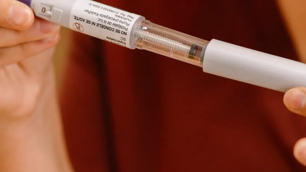
Half-unit dose increment insulin pens have been shown to deliver low insulin doses more accurately than syringes. They offer greater flexibility to hit target doses in young children and adolescents with type 1 diabetes. This precision matters clinically because research shows a positive correlation between hypoglycemic events in children and errors in regular insulin dose accuracy. In a user-perspective evaluation of the JuniorSTAR half-unit pen, 98% of participants reported that the pen's ease of reading, dialing, and dialing back helped achieve a high level of dose dialing accuracy, with 93% agreement among children and parents and 100% among nurses.
According to Bzowyckyj, the ability to give half-unit doses is an exciting development. Individuals who are especially sensitive to insulin — such as children and older adults — and who use low amounts may be more prone to dosing errors. Half-unit functionality, like that found in the Humalog Junior KwikPen, makes it easier to deliver just the right amount of insulin.
Small doses magnify every tiny error. A slight shift in the plunger position or a misread line changes the delivered amount by a larger percentage when the total dose is small. Insulin syringes that are clearly marked for precise dosing reduce this risk. Look for bold, well-spaced lines and half-unit increments if your dose is low. These features help you measure the insulin dose with confidence and reach the correct dose every time.
Material, Printing, And Etching On The Syringe
The material of the barrel and the way the scale is put on both affect how well you can see your dose. Clear plastic has many good points, but it creates a basic problem with contrast. How makers print or etch the markings adds another layer of trouble.
Low-Contrast Ink On Clear Plastic
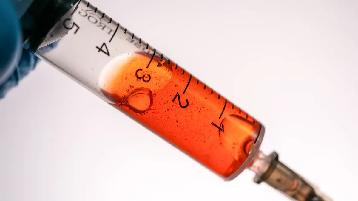
A clear barrel lets you see the insulin inside, which helps you spot the insulin and air bubbles easily. That same see-through quality works against the markings. Clear polypropylene takes in less light during laser marking, which lowers the marking contrast on syringe barrels. The background and the lines have similar light levels, so your eye has a hard time telling them apart.
Makers use medical-grade ink that resists chemical corrosion and stays stable under UV light for the numbers. They also use laser-etching for the graduation lines, with each line about 0.1 mm wide and 0.05 mm deep. Black laser-etching gives strong contrast against clear barrels. Some insulin syringes use big, bold numbers that stay visible for patients with vision problems. Ultra-clear barrels help the measurement lines stand out. Some syringes even have magnified viewing strips. The ink or pigment should not rub off while you use it, and the markings must hold up when wiped with alcohols. Graduation markings go through 10,000-cycle abrasion testing to make sure they stay clear and do not fade. The maker states strict compliance with ISO 7886-1 standards. These steps help readability, but the clear barrel still limits how much contrast you can get.
Embossed Markings And Glare
Some makers emboss the markings into the plastic instead of printing them with ink. Embossed markings last forever and cannot rub off. They also catch light in ways you cannot predict. At some angles, the raised or sunken lines bounce light back at your eye and make glare. That glare washes out the barrel scale and makes the markings harder to tell apart.
Glare gets worse under bright overhead lights or when you hold the syringe at an angle. You can cut this effect by turning the barrel a little or by changing your viewing angle. A two-stage laser method, with a light prep scan followed by the main pass, has been shown to raise contrast without making deeper marks. Small changes like adjusting the hatch pitch can improve results even more. When markings are easy to read, you draw your dose with more confidence. Look for insulin syringes with high-contrast graduation print and indelible black ink. These features boost visibility and help you measure accurately every time.
Visual, Physical, And Manufacturing Factors
More than just barrel size and line thickness affect how well you see the scale. Parallax, lighting, and font size all change what you see. How the syringe is made also matters.
Parallax, Lighting, And Small Font
Parallax error happens when you look at the syringe from an angle instead of straight on. The line seems to move compared to the plunger. Marks that sit close together can turn this shift into a full graduation. To lower parallax error, hold the syringe at eye level and keep it straight to your line of sight.
The angle matters more than you might think. A tilted syringe can cause over-dosing or under-dosing. Read the bottom of the meniscus directly. Lining up the plunger helps you read the dose clearly.
Dull lighting adds another problem. Small font numbers become harder to tell apart from the lines. Even a sharp eye struggles when the room is dim. Add more light and keep the syringe level in front of you.
Faint Or Shallow Markings From Wear
Some insulin syringes have markings that are faint or shallow from the start. The print may be light gray instead of black. The etch may be so thin that lines blend into the plastic. These conditions get worse after storage or handling. Wiping the barrel with alcohol can wear down the faint lines.
How the syringe is made explains much of this. One batch of insulin syringes may have crisp, dark lines. Another batch may look washed out. This is not a sign that your eyesight is failing. It is a design and production issue.
You can improve visibility by choosing a syringe with bold, high-contrast lines. Ask your pharmacist to show you options that make markings easier to read. A simple comparison can reveal the best readability. Correct dosing becomes easier when you find a brand you can see clearly. Good lines make correct dose delivery safer, especially for small doses. Select an insulin syringe that lets you measure every unit with confidence.
Narrow barrels, tiny lines packed close together, poor contrast, parallax, dim lighting, and differences in how syringes are made all make the scale hard to read. These are design problems, not signs that your eyesight is failing. You should not blame yourself for having trouble.
When you shop for insulin syringes, look for features that make them easier to read. A readable barrel often has a wider diameter, bold markings, or high-contrast colors. Ask a pharmacist or diabetes educator to help you compare options. They can point you toward insulin syringes that let you see every line clearly. That clarity helps you draw the correct dose of insulin with confidence.
FAQ
Does a smaller barrel always mean a harder-to-read scale?
Yes, a smaller barrel usually packs the same unit marks into less space. A 0.3 mL syringe fits 30 units into a short barrel, so the lines sit close together. A 1.0 mL barrel spreads marks at 2-unit intervals, which gives your eye more room to separate each line.
Can I use a U-100 syringe with U-40 insulin?
No. The concentration ratio between U-100 and U-40 is 2.5. If you draw U-40 insulin into a U-100 syringe and read the same number, you deliver only 40% of the intended units. Always match the syringe scale to the concentration on the insulin label.
Why do my syringe markings seem to shift when I move my head?
You are seeing parallax. Your reading shifts when your eye is not level with the plunger and the markings. Hold the syringe at eye level and keep it straight to your line of sight.
Do half-unit markings really help with small doses?
Yes. Half-unit markings split a whole unit into two smaller steps. This added detail supports correct dosing when your prescribed dose falls between whole units. Small doses magnify every tiny error, so a slight plunger shift or misread line changes the delivered amount by a larger percentage.
What features should I look for in a syringe I can read clearly?
Look for a wider barrel diameter, bold markings, and high-contrast colors. Black laser-etching gives strong contrast against clear barrels. Some syringes use big, bold numbers or magnified viewing strips. Ask a pharmacist or diabetes educator to help you compare options and find a syringe you can see clearly.